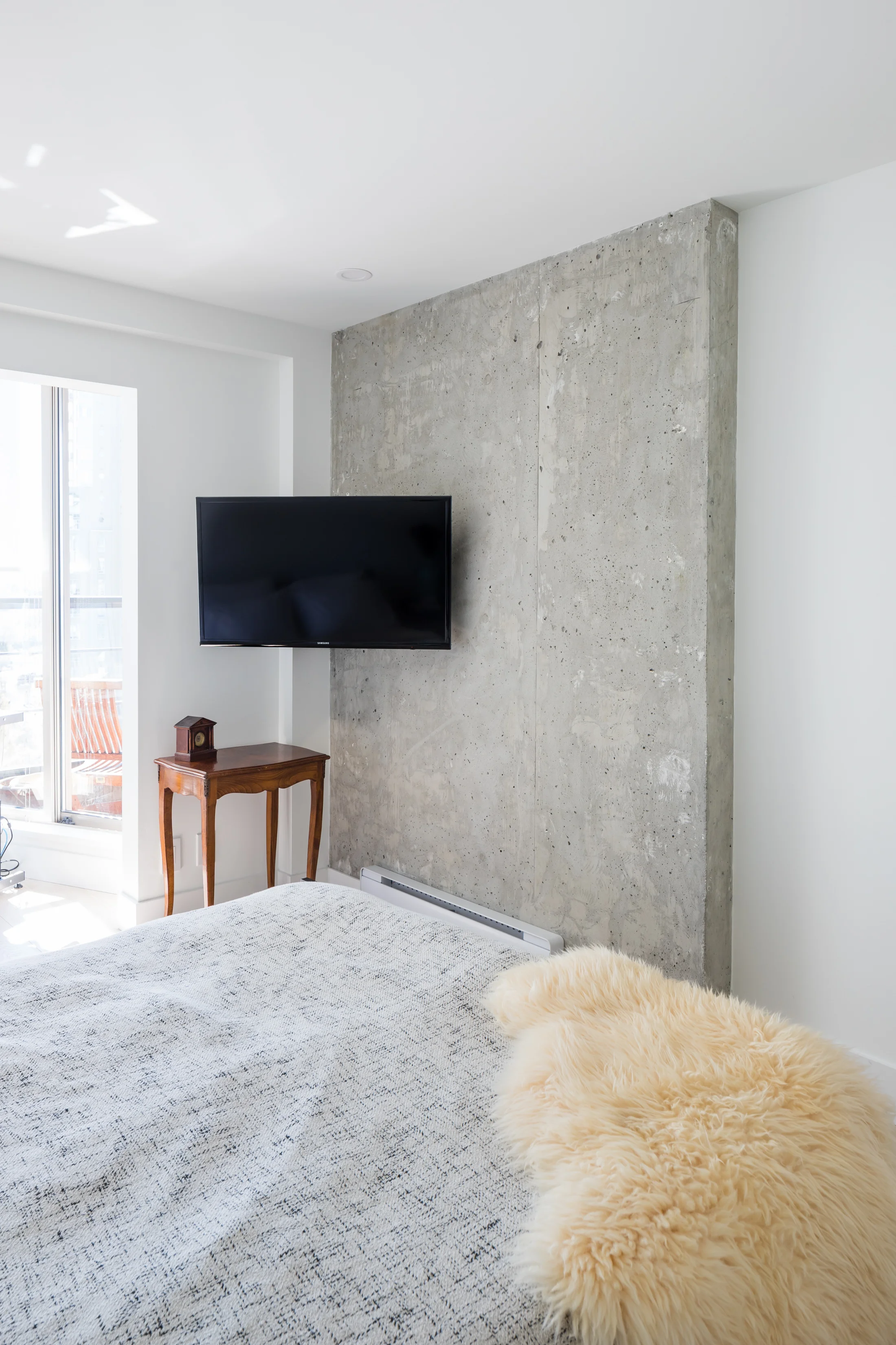
Our Pacific St project was all about neutralizing the space from its existing bold colours into a bright, sleek, and contemporary space. We wanted a simple design to showcase the amazing views. We chose to have white walls and cabinets with lighter-toned floors and counters to minimize visual distractions and keep the feel of the room simple, light, and airy. We brought in contrast and pops of texture through black accents and a fireplace cabinet built out of the flooring material.
The space now feels like your mind has some space to breathe and unwind from your busy city life while enjoying the view.
CLICK ON IMAGES TO ENLARGE
“I loved her process of asking me to provide inspiration photos of design and products I liked; and in our meetings during the design phase she sought my input and knew when to gently push me out of my comfort zone so that we ended up with exactly what I needed.
Cara’s design was better than anything I could conceive or imagine. My friends paid her the highest compliment when they told me “my home now truly reflects me”.”


